There is an overwhelming number of options for developers needing to provide data visualization. The most popular library for data visualization in Python is Matplotlib, and built directly on top of Matplotlib is Seaborn. The Seaborn library is “tightly integrated with the PyData stack, including support for numpy and pandas data structures and statistical routines from scipy and statsmodels.”
This article is only intended to get you started with Matplotlib and Seaborn. Both libraries have extensive and mature documentation.
§2026 Update
Matplotlib and Seaborn are still the standard pair for static Python plots, which is exactly the report-generation use case this post is about. The versions moved a lot since 2018 (Matplotlib 2.2 to 3.x, Seaborn 0.8 to 0.13 and beyond), and most of the code below runs unchanged. One function does not.
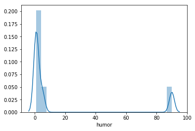
seaborn.distplot was removed. It was deprecated in Seaborn 0.11 and dropped in 0.14. The histogram example below that calls sb.distplot(df_ai_t['humor']) becomes sns.histplot(df_ai_t['humor']) for an axes-level plot, or sns.displot(df_ai_t['humor']) for the figure-level version. Everything else here, countplot, regplot, scatter, subplots, and plt.hist, still works.
While you are updating imports: Seaborn is universally imported as sns, not sb. The examples use sb, which works but reads oddly to anyone else. And as of Seaborn 0.12 there is a new objects interface, import seaborn.objects as so, a composable grammar-of-graphics API worth knowing once you outgrow the function-based one.
The documentation links below are updated to the current Matplotlib and Seaborn sites.
Original article below. Everything from here down is the post as originally written. The 2026 Update above covers what’s changed since.
§Data Visualization Landscape
For large scale business analytics and analysis, there are commercial tools such as Tableau or Pentaho, they look great and have ample features, yet they have high costs and implementation commitments, not to mention vendor lock-in. Commercial applications and large visualization platforms focus your development around their feature set.
For front-end interactive developers there are open source javascript libraries like d3js/c3js. However, these solutions are often overkill for simple, static bar charts, histograms and plots; they are also problematic for print and PDF.
It’s common in many of my projects to generate static reports. These static reports are designed in HTML and use a tool I built called txpdf, a Webpage to PDF Microservice I use to convert them to PDF and email them to the appropriate stakeholder. I use serverless Python functions with numpy and pandas to process many forms of data, which makes Matplotlib with Seaborn an excellent tool for adding data visualization to these reports.
§Notes on Data
In the following examples, I’ll be making up some simple data with small datasets for brevity in the demonstration. However, if you are looking to experiment with a large variety of publicly available datasets, I recommend you visit kaggle.
§Python Libraries
This article is written using Jupyter Notebooks installed and running under Anaconda. I recommend this setup for experimenting and learning. In the examples below I use Python 3 with the libraries numpy, pandas, Matplotlib and Seaborn. The Anaconda command conda list shows me the available libraries and their installed versions. The line %matplotlib inline instructs Jupyter Notebooks to display Matplotlib output inline, rather than rendered to a file. If you are running Anaconda you likely have all the required libraries.
import numpy as np
import pandas as pd
import matplotlib.pyplot as plt
import seaborn as sb
import warnings
warnings.filterwarnings('ignore')

%matplotlib inline

!conda list numpy
!conda list pandas
!conda list matplotlib
!conda list seaborn
# packages in environment at /Users/cjimti/anaconda3:
#
# Name                    Version                   Build  Channel
numpy                     1.13.3           py36ha9ae307_4
numpy-base                1.14.3           py36ha9ae307_2
numpydoc                  0.8.0                    py36_0
# packages in environment at /Users/cjimti/anaconda3:
#
# Name                    Version                   Build  Channel
pandas                    0.22.0           py36h0a44026_0
# packages in environment at /Users/cjimti/anaconda3:
#
# Name                    Version                   Build  Channel
matplotlib                2.2.2            py36ha7267d0_0
# packages in environment at /Users/cjimti/anaconda3:
#
# Name                    Version                   Build  Channel
seaborn                   0.8.1            py36h595ecd9_0
§Dataset
Below I set up a simple data set in a Pandas using a DataFrame.
ai = {'wintermute': pd.Series(data = [1, 4030, 100, 100], index = ['type','id','dangerous','intellect']),
      'hal': pd.Series(data = [1, 70, 100, 90, 20], index = ['type','id','intellect','dangerous','bending']),
      'rachael': pd.Series(data = [2, 7192, 80, 40], index = ['type','id','intellect','dangerous']),
      'johnny 5': pd.Series(data = [2, 836, 12, 5, 2], index = ['type','id','dangerous','humor','bending']),
      'ava': pd.Series(data = [2, 9272, 80, 95, 10], index = ['type','id','intellect','dangerous','bending']),
      'bender': pd.Series(data = [2, 7912, 20, 50, 90, 100], index = ['type','id','intellect','dangerous','humor','bending'])}

df_ai = pd.DataFrame(ai)

# replace NaNs with ones assuming our bots have at least
# some capability in each category
df_ai.fillna(1, inplace=True)

# transpose
df_ai_t = df_ai.T

# convert to integers
df_ai_t = df_ai_t.astype(int)

# let jupyter output a nice html table
df_ai_t
| bending | dangerous | humor | id | intellect | type | |
|---|---|---|---|---|---|---|
| ava | 10 | 95 | 1 | 9272 | 80 | 2 |
| bender | 100 | 50 | 90 | 7912 | 20 | 2 |
| hal | 20 | 90 | 1 | 70 | 100 | 1 |
| johnny 5 | 2 | 12 | 5 | 836 | 1 | 2 |
| rachael | 1 | 40 | 1 | 7192 | 80 | 2 |
| wintermute | 1 | 100 | 1 | 4030 | 100 | 1 |
§Bar Charts
Seaborn’s seaborn.countplot delivers nice and simple quantitative representations of qualitative data sets.
§seaborn.countplot
We have two types of AI bots, three of type 1 and 2 of type 2 using seaborn.countplot we can see a quantitative comparison.
sb.countplot(data = df_ai_t, x = 'type'); # the semi-colon suppresses object output info
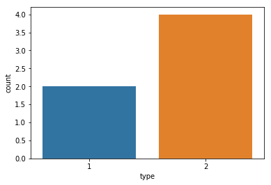
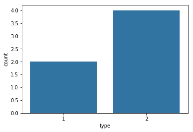
Automatic coloring of the data can lead to the unintended highlighting of data. If we only want to present the value differences, it is better to have a uniform color.
We can get a list of colors from the Seaborn color pallet and set the color with one of the tuples.
sb.color_palette()
[(0.12156862745098039, 0.4666666666666667, 0.7058823529411765),
 (1.0, 0.4980392156862745, 0.054901960784313725),
 (0.17254901960784313, 0.6274509803921569, 0.17254901960784313),
 (0.8392156862745098, 0.15294117647058825, 0.1568627450980392),
 (0.5803921568627451, 0.403921568627451, 0.7411764705882353),
 (0.5490196078431373, 0.33725490196078434, 0.29411764705882354),
 (0.8901960784313725, 0.4666666666666667, 0.7607843137254902),
 (0.4980392156862745, 0.4980392156862745, 0.4980392156862745),
 (0.7372549019607844, 0.7411764705882353, 0.13333333333333333),
 (0.09019607843137255, 0.7450980392156863, 0.8117647058823529)]
# use the first color from the color_palette array (index 0)
sb.countplot(data = df_ai_t, x = 'type', color=sb.color_palette()[0]);
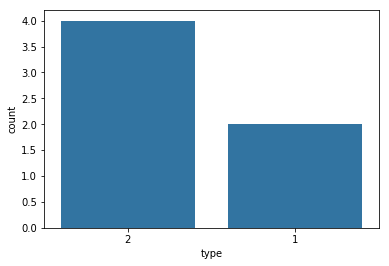
# order by type count
type_order = df_ai_t['type'].value_counts().index
sb.countplot(data = df_ai_t, x = 'type', order=type_order, color=sb.color_palette()[0]);
§Histograms
§matplotlib.pyplot.hist
Using histograms for univariate quantitative variables using matplotlib.pyplot.hist.
# the dataset
df_ai_t
| bending | dangerous | humor | id | intellect | type | |
|---|---|---|---|---|---|---|
| ava | 10 | 95 | 1 | 9272 | 80 | 2 |
| bender | 100 | 50 | 90 | 7912 | 20 | 2 |
| hal | 20 | 90 | 1 | 70 | 100 | 1 |
| johnny 5 | 2 | 12 | 5 | 836 | 1 | 2 |
| rachael | 1 | 40 | 1 | 7192 | 80 | 2 |
| wintermute | 1 | 100 | 1 | 4030 | 100 | 1 |
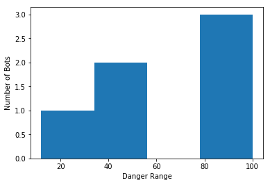
Plotting the dangerous attribute of our bots into a histogram.
plt.hist(data = df_ai_t, x = 'dangerous', bins = 4);
plt.xlabel('Danger Range')
plt.ylabel('Number of Bots');
§seaborn.distplot
Using seaborn.distplot to visualize a univariate distribution of bot humor observations.
sb.distplot(df_ai_t['humor']);
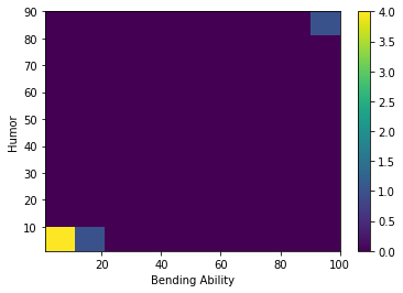
§matplotlib.pyplot.hist2d
A 2D histogram using matplotlib.pyplot.hist2d correlating bending with humor.
plt.hist2d(data=df_ai_t, x='bending', y='humor')
plt.colorbar()
plt.xlabel('Bending Ability')
plt.ylabel('Humor');
§Scatterplots
Using scatterplots for bivariate visualizations of quantitative vs quantitative data.
# the dataset
df_ai_t
| bending | dangerous | humor | id | intellect | type | |
|---|---|---|---|---|---|---|
| ava | 10 | 95 | 1 | 9272 | 80 | 2 |
| bender | 100 | 50 | 90 | 7912 | 20 | 2 |
| hal | 20 | 90 | 1 | 70 | 100 | 1 |
| johnny 5 | 2 | 12 | 5 | 836 | 1 | 2 |
| rachael | 1 | 40 | 1 | 7192 | 80 | 2 |
| wintermute | 1 | 100 | 1 | 4030 | 100 | 1 |
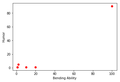
§matplotlib.pyplot.scatter
Statistically quantifying the strength of linear correlation between humor and bending using matplotlib.pyplot.scatter.
plt.scatter(data = df_ai_t, marker="o", color="red", x='bending', y='humor');
plt.xlabel('Bending Ability')
plt.ylabel('Humor');
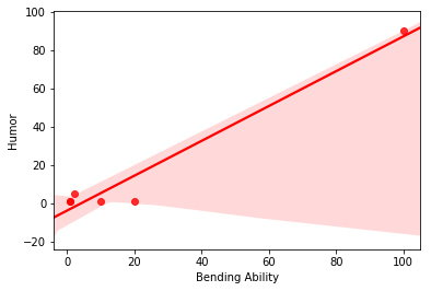
§seaborn.regplot
A linear regression model fit of humor and bending using seaborn.regplot.
sb.regplot(data = df_ai_t, marker="o", color="red", x='bending', y='humor');
plt.xlabel('Bending Ability')
plt.ylabel('Humor');
§Subplots
§matplotlib.pyplot.subplots
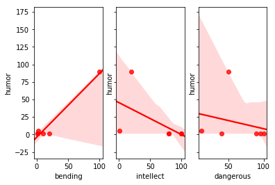
Visualizing correlations of bending, intellect and dangerous to the shared y-axis humor using matplotlib.pyplot.subplots.
fig, (ax1, ax2, ax3) = plt.subplots(nrows=1, ncols=3, sharey=True)

sb.regplot(ax=ax1, data = df_ai_t, marker="o", color="red", x='bending', y='humor');
sb.regplot(ax=ax2, data = df_ai_t, marker="o", color="red", x='intellect', y='humor');
sb.regplot(ax=ax3, data = df_ai_t, marker="o", color="red", x='dangerous', y='humor');